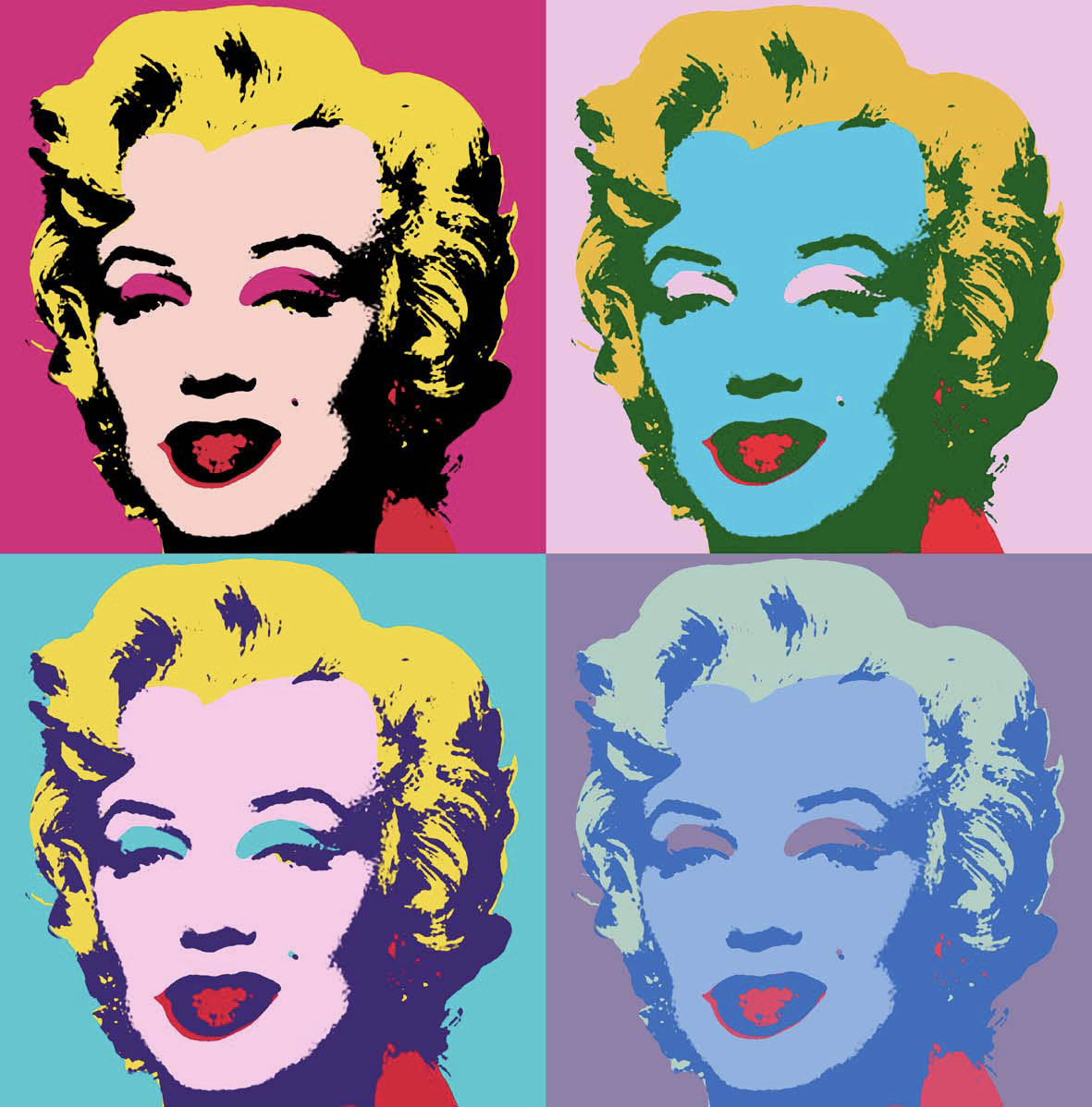
In the first font (HolyFat), errors in spacing are abundant. It is hard to identify exactly what needs how much space, as the letters are written in script in such a way that many extend outside of their geometrical grids to mimic the inaccuracy of handwriting. However, some spacing issues can still be corrected. In the capitalized portion, the E and H are too far apart in the word ‘THE’ compared to thealmost too tight spacing between the T and the H. many letters find themselves intruding on others spaces, such as the E and R in ‘OVER’, the O and W in ‘Brown’, and the L and A as well as the Z and Y in ‘LAZY’.
In the lowercase Holyfat type, the spacing is better than that of its capitalized brother, but still has many mistakes in spacing. One example is the distance between M and P in ‘jumps’. Another can be seen in the distance between O and G in ‘dog’.
Lastly, we have the final font, Thor Gonzales, which is exclusively in Uppercase. There are issues with the tightness of T and H in ‘THE’, the A between L and Z in ‘LAZY’, the O and W in ‘BROWN’, the J and the U in ‘JUMPS’, the V between the O and the E in ‘OVER’, and the D and the O in ‘DOG’.
Cylburn is a semi-connected script with a slight rightwards tilt. The consistency of width in made to replicate that of a pointed paintbrush. The type is at its thickest on the down stroke, as if the painter were pushing the brush down with some weight, while the thinnest is on its horizontal strokes, as if the brush were quickly flicking across the page.Orwellian is a reverse-stress type with very geometric forms and high contrast. The type, unlike most typefaces, is at tits thickest on the highest and lowest horizontal stroke, with extremely fine lines connecting the vertical elements.
In chapter 3 of The Principles and Practice of Graphic
Design, the focus shifts to typography and the integration of it into graphic design.
The chapter begins by giving a definition of typography and how meaning is
found in it. Typography is meant to both be beautiful to look at, as well as
hold meaning in the words written as well as how they are written. The chapter
continues with a breakdown of the anatomy of type and typeface, explaining how
some fonts utilize different stresses and measuring to create a unique aesthetic.
The book also makes sure to mention the importance of choosing a typeface for
specific purposes and having a deep understanding of the history of each
typeface so you know how best it can be utilized in design. The importance of
spacing is also discussed, giving readers an understanding of how instrumental something
as simple as the distance between letters and words can be when it comes to
meaning and clarity in a work of graphic design. Finally, readability and
legibility of type is explained. It is here we understand how important it is that
our type can be deciphered and understood, or else its fundamental purpose is
lost.
In an article written by Ilene Strizver for fonts.com, similar ideas to the chapter of our text is discussed. When selecting type for text, there are many factors to consider. Firstly, one should consider the demographic of their work, or who the intended audience is. Anything from age to interest can influence who sees the design and what they take away from it. Just like in the book, the article emphasizes legibility. Type face should be eye-catching and easy to read (unless they’re specifically chosen to be illegible). Regardless, one’s ability to read type should always be considered. The size of the font is also extremely important. Size can affect the hierarchy of the design, on top of the legibility. The article also brings up how some typefaces have special features attached to them, such as a range of ligatures, characters, and sometimes support for other languages. These abilities can influence how many different words and symbols you can utilize in your work, as well as who can see in in the way you believe it is meant to be seen. Lastly, where work is published can affect how the design should be portrayed. Some typefaces have lower qualities to them and should not be seen blown up, while some font sizes are too small for screens, but the sizes for a poster may look different than that of a website.
An example of the subtle details that differentiate fonts. In the blue we can see examples of the font Arial paired up with its red counterpart, Helvetica. Here we can see the small details that go into making fonts memorable and unique.An example of how many different types of font can be paired up to match and compliment each other. Some fonts can be very similar in style, while others can feel like total opposites. An example of type hierarchy being utilized. Here we can see color, fonts, and positioning all being used to assist in a chronology to the text on display. The type is well organized and easy to follow. And example of how type can be integrated into image. In this design, we see the stylized ampersand. However, when the photo is rotated counter clockwise 90 degrees, a highly stylized ‘and’ can be seen.
For my type of choice, I decided to go with the back cover of my textbook “Classic Penguin: Cover to Cover”. The thing that succeeds the most about this typographic layout is the way its able to equally space out each author in a way that creates a very clean and cut border. Specifically with the little snippet of information in the top, the text fits perfectly in the square with a sustained border without having inconsistent leading.
In the opening pages of Graphic Design School: The Principles and Practice of Graphic Design, and introduction of what this book hopes to teach us is given. The author lays out a road map of what is to come in each of the main sections of the text, and what we as reader should take away from each. The book begins by emphasizing the importance of research and conceptualization in the beginning of the design process. The author illuminates the importance of existing in the world in order to draw inspiration from what is naturally around us and other creators. One should be constantly looking to expand their view of the world, constantly stretching the boundaries of not only their visual language, but also their personal life.
A designer should never limit themselves to one way of thinking or one medium of comfort. A truly great designer uses every skill at their disposal, and works to refine the other skills that are new and foreign to them. Inspiration can come from everywhere and anywhere, and the limitations that we enforce on ourselves will only cause us to asphyxiate of the comfortable and overused.
In an article by Michelle Lee, a Graphic Designer from Toronto, she gives her best advice on how to stay creatively inspired. Lee begins by suggesting that when we find something that provides creative enlightenment, we dig deeper to understand what exactly about it provides a feeling of inspiration in the first place. Learn to observe in such a way that you decipher the intricacies of what pulls you into a visually appealing piece. Lee also emphasizes the importance of utilizing free-flowing thoughts, simply by focusing on the basics, like doodling and sketchbooks.
Another tip is to utilize all those around ourselves with more experience and varied skill sets. We live in a time with more visual creators than ever before. And creators, more than anyone, know the struggles that the designer can encounter. Ask for second opinions and advice, and don’t be afraid to ask for assistance and to receive critiques.
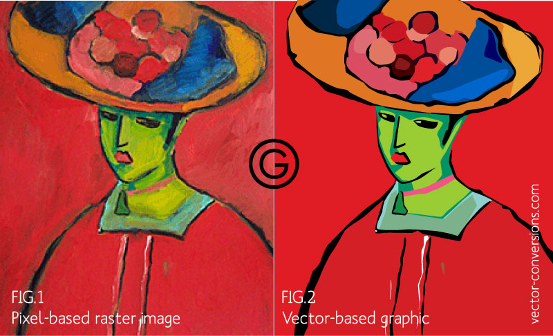
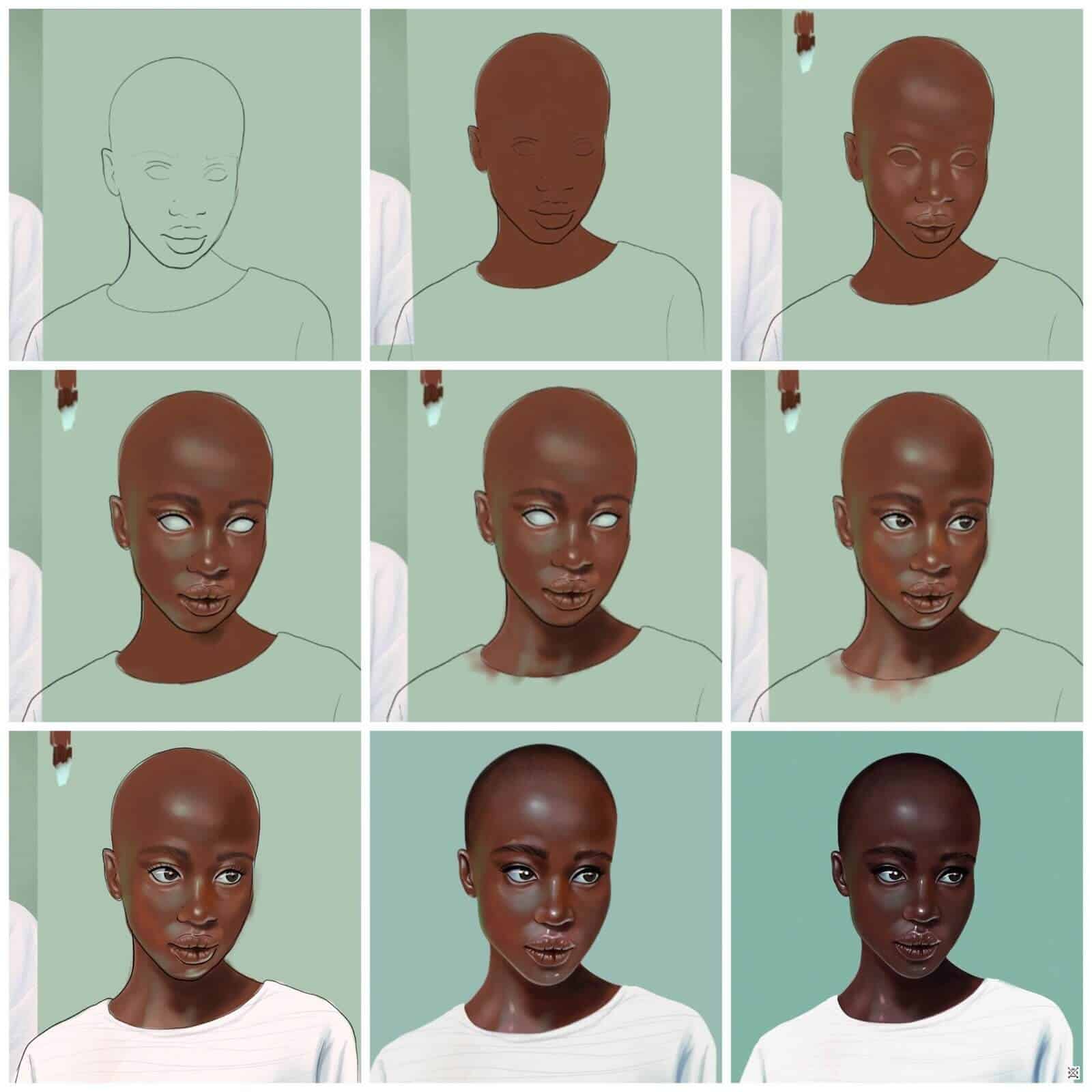
Here we see an example of pictograms. Pictograms are used to represent ideas universally to people, using visuals as the language instead of words. The pictograms act as visual metaphors that allude to ideas and concepts, like these images that are meant to communicate hazards.This example shows how we can associate identity to an icon. The Pepsi logo is abstract and resembles nothing simplistic, yet its color, use of negative shape, and effective simplicity has given it life for many years. Now, even with out any text, we can look at the image and relate it directly to Pepsi without a second thought.An example of the work differs in different digital spaces. One image is a raster image, meaning it is made by pixels and can have more complex forms, but is limited to the size of the pixels and cannot be individually manipulated. Vector images are made up by shapes, meaning it loses some detail, but now can be adjusted using its individual shapes.Example of process in creating visuals. This artist moves through phases to create the artistry in the last frame. Beginning with a simple sketch for the shape, moving to color, and slowly adding more highlights and shadows makes the piece pop and feel three-dimensional.
Postmodernism is not only a defiance and revision of Modernism, but it was a way to blur the line between high and low culture, and most importantly what makes up Postmodernism is believing that a design for a better world comes from within a culture rather than from above it. Modernists were trying to reflect modern experiences through form and thus tried to make global communication clearer and enrich life as a whole. Postmodernists felt that the way it was done was snobbish and detached from reality, and comes out of a bubble in the mind of the designer or artist. They simply felt like they were doing what Modernists were trying to do, but better and more realistically. That’s why it’s called Postmodernism; it is still Modernism in a way. It is still, essentially, an approach that claims to better the world through visual communication that sets a strong relation between contemporary life, and form.
The first major style of art after the Renaissance was academic art, the classical style taught by professors in the Academies. Academic art is the artistic equivalent of the traditional “suit and necktie”. Next, about 1870, comes “modern art”. This is the artistic equivalent of the “shirt and pants” or “jacket and slacks”. Next, about 1970, comes “postmodern art”, which is the artistic equivalent of the “jeans and T-shirt”, or in some cases, the ‘thong and baseball cap’. In the same way that dress codes have become less formal and more “anything goes”, so today’s artists are less impressed with the old ideas of what art should be, and more focused on creating something (or anything) that strays from the norm in new and interesting ways.
But informal dress like jeans and T-shirts have only become popular because society itself has become less formal. In the same way, as we shall see, “postmodernist art” is part of a wider current of technological, political and social change in the West, which has introduced many new attitudes and new types of behavior. The full impact of the Internet, for instance, on the sourcing and distribution of artistic imagery, and on the creation of applied art and design, has yet to be truly grasped.
Minimalism is one of the most influential styles today – from
design, to architecture, to music, to literature. In fact, there’s every chance
that you’re a fan of minimalism even without knowing it.
Contrary to what you might think, minimalism was never inspired
by poverty and austerity.
In fact, it’s frequently considered a
style of the super-rich. The attitude is: I can have anything, but I won’t
clutter my home; instead, I will acquire only the most elegant, simple objects
available.
It is simple in form and function, devoid
of pointless decorations, yet expensive. You would never say minimalism is a
cheap option.
Formally, minimalism is 1960s and 1970s
invention. However, De Stijl and traditional Japanese design could be
considered predecessors of minimalism.
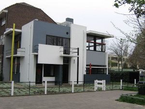
De Stijl Movement
De Stijl (Dutch for “The Style“), also known as neoplasticism, was an artistic movement in the Netherlands. It began in 1917 and faded around 1931. Its leading figure was The Van Doesburg who died in 1931, and this basically marked the end for the De Stijl movement.
This movement existed only for a short
time but layed the foundations of minimalism.
The major principles advocated by De
Stijl movement are simplified visual compositions to the vertical and
horizontal directions, and use of only primary colors (together with black and
white).
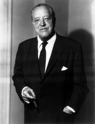
Ludwig Mies van der Rohe and “Less Is More”
Another
hero of minimalism is the German architect Ludwig
Mies van der Rohe (1886-1969). It is no exaggeration to say that in
addition to being a key figure in minimalism, he is also one of the fathers of
modern architecture with its clean forms.
Indeed,
city skylines from New York to Beijing own much to Mies van der Rohe work.
Van
der Rohe aimed for simplicity and clarity and his trademark approaches are:
The use of modern construction materials like steel and plate glass
The eduction of structural frameworks to a minimum
The inclusion of lots of open space
His
principles are still in use today – not only in architecture but in design as
well. His contribution to minimalism doesn’t end here. He is also the author of
the “Less Is More” motto, which is one of the main principles of
minimalism.
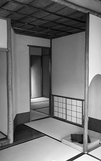
Traditional Japanese Design
Traditional
Japanese design (i.e. before the influence of the West) with its simplicity and
clean forms is considered another predecessor of minimalism.
This
is a reflection of Japanese culture itself where simplicity has long been
prized, and all that’s not essential to the functionality of a thing is not
included in its design.
The
list of heroes of minimalism across arts (architecture, painting, music,
design) is long. Some of the more prominent minimalists include Buckminster
Fuller, Dieter Rams, Donald Judd, John McCracken, Agnes Martin, Dan Flavin,
Robert Morris, Anne Truitt, Frank Stella.
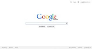
Google
Google
is arguably the best example of functional minimalism applied today. The
startup interface of nearly all its services is clean and minimalist.
For
instance, the starting page of the search engine is plain simple: a search box,
2 search buttons, and the Google logo.
What’s
more, the logo itself is in (next to) basic colors, which is another typical
feature of minimalism.
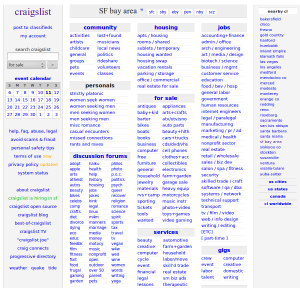
Craigslist
Craigslist
is certainly not the first site you think of when you talk about ‘high design’.
But
in many ways, the most popular site for classified ads is a minimalist’s
delight.
It
has a very straightforward structure and a color palette even De Stijl designers
will love.
The site is all about functionality – no fluff, no decorations, no distractions.
Artifact
I had my group members replicate a minimalist style of the time period, emphasizing line and geometric pattern.
Citations
Mokhov, Oleg, et al. “Minimalist Design: A Brief History and Practical Tips.” SpyreStudios, 10 May 2011, spyrestudios.com/minimalist-design-a-brief-history-and-practical-tips/.
In today’s world, movies and tv are next to impossible to ignore. Television sets can be found in almost every single house in the world, devoted solely to displaying the moving images that have shaped the last 100+ years of entertainment. The modern day empire of film making, like many things, begins in a place of humble beginnings.
To many, the father of the motion picture was the eccentric, english inventor and and photographer, Eadweard Muybridge. Muybridge was born in 1830 in England, until he immigrated to the United States, where most of his greatest work would occur.
In 1872, Muybridge was hired by railroad magnate Leland Standford to use his skills in photography to prove that all four legs of a horse are off the ground while the horse trots. When Muybridge attempted to answer this question, he found that his camera lens was not nearly fact enough, proving his first attempts to be unsuccessful. Five years later, Muybridge picked up the project once again, not yet satisfied with his answer. Muybridge upgraded his set up, this time creating a battery of 12 to 24 cameras with special shutters he created specifically for this experiment. Muybridge also opted for a more sensitive photographic process, resulting in less time needed for exposure when taking a photo. Once he got the pictures of the horse running, the phtotos were then mounted on the interior of a rotating wheel, dubbed the “Magic Lantern” (later renamed the zoopraxiscope). This device can be considered the worlds first movie projector. It worked by shinning light through a revolving sequence of successive photos, creating the illusion of movement.
From this point on, the evolution process for motion picture begun, captivating the world and shaping the way we tell stories. Over the next century, the medium adapted itself, eventually adding color, sound, and three dimensional effects.
Today, the illusion of movement is one of the most utilized forms of visual communication today. One would be hard-pressed to make it through a single day without finding this illusion of movement. One of the most fascinating things about the visual medium is how the fundamental trick in creating movement has not changed from its initial conception back in 1877; a series of rapidly moving, successive photos. We have only really refined the way these images are viewed, increasing the amount of images we are able to show within a single second, ranging from 24 to 30, to even 60 frames a second on modern-day screens.
One of the art forms that still finds itself very in tune with its origins in the process of stop motion animation. while it still uses the same fundamental principle as all other motion based media, the process of obtaining the images that create a photographic sequence is more tedious.
In stop motion, each subsequent image is precisely set up and taken, one by one, frame by frame. Rather than obtaining images as they happen, like in most motion based cameras, stop motion animators set up scenes in which the characters and world around them is changed ever so slightly to create movement. This process is daunting to say the least, and can take hundreds of highly trained animators and thousands upon thousands of hours.
Throughout history, fonts have been created to meet the needs of the designer. In the last new lectures, our class had a look into the history of historically significant fonts like Garamond, which replaced gothic fonts in early printmaking, and Baskerville, which bridged the gap between old style and modern. Some of these classic and groundbreaking fonts were ridiculed for their innovations when first designed, but through time and longevity, it was proven to the public that these fonts would become the backbone of the following hundred years of typographic design. However, the discussion of historic fonts got me thinking of other ‘groundbreaking’ fonts that would shake the world of design going forward; specifically, the iconic Comic Sans.
Arguably the most divisive font in history, Comic Sans was conceived in the lead-up to Microsoft’s 1995 consumer-oriented operating system, Windows 95. Years before working with Microsoft, typographic engineer, Vincent Connare, was working on his undergrad in New York City. In his time there, he spent a good amount of time in art galleries, admiring and critiquing the work he found. To Vincent, what separated good art from bad art was this; if you notice art, it is good. In his mind, the art had made you stop and look, in a shocking or aesthetically pleasing way.
Vincent took that philosophy to Microsoft, where he was given the task of creating a playful font for Microsoft Bob, a software intended to provide a more user-friendly interface for Windows OS’. For inspiration, Vincent Connare looked to graphic novels like Batman and the Watchmen, where hand-lettering styles illustrate the thoughts and monologues of characters. From there he mimicked the style simply by looking at comic books and drawing straight to the computer. “I didn’t have to make straight lines. I didn’t have to make things look right. And that’s what I found fun”. However, not everyone loved the font from the get-go. Robert Norton, Vincent’s boss, didn’t like the font initially, and thought it needed to be more typographic. Vincent argued that it needed to be unique and weird in order to stand out from other boring and predictable typefaces.
The font ended up missing the deadline for Microsoft Bob, but was eventually installed on ever Macintosh computer by 1996. From there, the font began seeing wide use, far beyond what Vincent could’ve hoped for. Since then, Comic Sans has spurred both praise and outrage. Its overexposure has prompted groups of designers to start an anti-Comic Sans campaign, in hopes to lessen the misuse of the font in professional atmospheres.
Vincent describes himself as content with his mark on history. To him, Comic Sans is not one of the better pieces of art ever made, but as a conceptual product, it is one of the best things he has ever created.
I chose to cover this topic because it functions as a modern day equivalent to the designers we are researching in our studies. Like them, the creation of this type kit was out of necessity for design’s evolution. In Bodoni’s case, it was created to convey a feeling of cleanness, good taste, and charm with regularity in a way previous font hadn’t. In Comic Sans’ case, it was to serve a purpose of ease and accessibility for the consumer. With every font came it’s share of sceptics, as with any new leap forward in art and society. As much as we associate Comic Sans with the culture of memes and products of immaturity, the font still stretches the boundaries of typography in countless of ways. And at the very least, it has gotten everyday people discussing the concept of typeface more than any other font ever created. And to Vincent Connare, that makes Comic Sans a success.
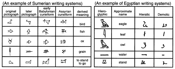
Writing is one of mankind’s most long-lasting and transformative technologies. For fifty-six hundred years, the ability to transmit thoughts beyond the lifespan of the thinker, to express ourselves, to give instructions, to communicate over space and time, has allowed us to make monumental strides in our understanding of not only the universe, but also each other. To understand how writing began, we have to travel back to ancient civilization of Sumer, where the first widespread use of writing started. Sumer was the land of the world’s first real cities, home to tens of thousands of people. And these cities formed city states bound together by the veneration of a specific set of gods. The people mastered irrigation and the cities grew, and as the cities grew, so too did the temples to the gods. But these massive, sprawling temple complexes didn’t serve only as houses of worship. These temples also served as enormous warehouses, acting as repositories for the vast wealth of the city. In good times, taxes, donations, and gifts would come flooding in. In times of sparsity, the surplus would be distributed back out. This system created vast wealth for the priests, but it also ensured that cities of this size could function. And ensuring that this system of repository was working, was a scribe making little marks on a clay tablet.
With an economy of this size, with tons of supplies moving in and out of the temple each day, they needed to keep records somehow. Scribes took up the position of tallying the influx of supply taken in by the temple daily on wet slabs of clay. That tablet will later be stored so that priests can know what exactly they have on hand in their giant temple warehouse. But as much as tally marks have their place in the origin of writing, there is something far more interesting on that wet piece of clay. You see, he has drawn a little picture of a grain stalk next to his tally marks, so its clear that his tallies refer to grain.
Over the generations, that little drawing of grain would get simpler; more abstracted. Scribes looking of quicker and easier ways to note common goods couldn’t laboriously draw every single item coming into the temple, but instead came to an agreed-upon set of symbolic representations for the goods flowing into the holy places. And you can see how somebody might quickly realize that those symbols could represent not only the concept of something, but the word itself. The symbol for cow came to be understood not only as a representative of the animal, but also of the word “cow” itself. Another innovation of writing came for the way the scribes would write on these clay tablets. Originally, the scribes wrote top to bottom, just as you would if you were making a list. That would soon change because the problem with clay is that it takes forever to dry and so if you ever set your hand down while you’re writing from top to bottom, you could easily obliterate whole sections of the column you just wrote. But this risk is reduced if you start writing from left to right. However, many in the temple didn’t like that innovation. It was easier on the scribes, but for the literate folk who had to read it, they had to learn to read from top to bottom, and so they didn’t like this sideways thing at all. So what did the scribes do? They simply rotated all of the characters 90 degrees so that a person could turn the tablet and read it from top to bottom just like they always had. Soon, people were just reading the sideways characters left to right. But because they had been flipped, they were even more abstracted from the pictures that they originally represented. This writing system was then adopted by the neighboring Akkadians and Elamites, who would abstract it even further.
The original pictures, and even the pictograms they became, vanished entirely into wedge-shaped impressions and line strokes made by the stylus favored at the time. Which means, instead of simply a handful of nouns to record storage lists, we have an abstract and lyrical system for writing.
So how does this ancient development of writing relate to our understanding of language today? It relates because our language is constantly evolving, just like the ancient Sumerian’s, especially with writing’s recent integration with technology. One doesn’t even have to look further than their cellphone to see proof of this evolution. Concepts like acronyms used in texting, such as ‘lol’ or ‘omg’, while seemingly trite, represents a monumental evolution of language. It is a simplification of writing, just like how the ancient Sumerians scribes would simplify the pictograms into an complete system of writing.
Interestingly enough, it seems like our language has even had a reintegration of image into our writing vocabulary, with the introduction of an emoticon system in recent years. This too has evolved, beginning as simple keyboard illustrations made up of colons and parentheses and turning into a seemingly universal library of emotions, objects, and signals to help elaborate in easily recognizable ways. While neither are seen as especially ‘proper’, the fact remains that they are being widely used, regardless of language or age, transcending previous limitations of many previous writing systems. And who knows? Maybe in a couple of decades an entirely image or acronym based writing system will be developed.
Artifact
For my artifact, I had my group members begin my presentation by each drawing a simple cow on a piece of paper in under twenty seconds. Then, I prompted them to see how many of that same cow they could draw on a separate sheet of paper in under 60 seconds. I told them they were free to simplify the cow, as long as they still saw it as recognizable to the first.
I did this to demonstrate how these ancient pictograms were altered and changed over time. The ancient scribes could not repeatedly draw detailed pictures of the animal or crop they were referring to on every single clay tablet, so the images were simplified and abstracted, just like my group’s pictures were.
Bryant, Charles W. “How Did Writing Evolve?” HowStuffWorks Science, HowStuffWorks, 8 Mar. 2018, science.howstuffworks.com/life/evolution/writing-evolve.htm.


:max_bytes(150000):strip_icc():format(webp)/high-speed-sequence-of-a-galloping-horse-and-rider-680806289-59c0259c68e1a20014827f5f.jpg)


